

Introduction:
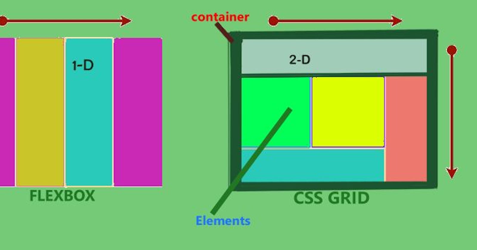
An intersection of vertical and horizontal lines is known as a grid. Major sections of a page are separated using CSS Grid layout. It is a 2-dimensional layout system that uses rows and columns to arrange elements within a grid container.
Terminologies associated with Grid:
Element: These refer to any element/content inside the grid container.
Row: A row is a horizontal line in the grid. Rows are numbered starting from 1 and are defined by grid lines.
Column: A column is a vertical line in the grid.
Gap: This refers to the spacing between rows and columns in the grid
Line :
What is grid container:
It acts like a holding box for all the grid items and defines the boundaries of the grid itself.
These HTML elements are commonly used as grid containers: <div>, <section> ,<main>, <article>,<header>,<footer>.
Properties associated with grid container*:*
Grid-template-rows: Defines the height of each row.
Grid-template-columns: Defines the number of columns in the grid and it can define the width of each column.
Align-content: Vertically aligns the whole grid inside the specified container.
Justify-content: It aligns the whole grid inside the container.
Benefits of using CSS Grid:
Flexibility and Control: It has control over element positioning and alignment so that complex layouts can be handled properly.
Responsive Layouts: Create responsive layouts so that the website can adapt to various screen sizes.
Modular Design: Make code cleaner and easier to maintain.
Improved Performance: It leads to an increase in performance.
Coding demonstration of it:
<!DOCTYPE html>
<html lang="en">
<head>
    <meta charset="UTF-8">
    <meta name="viewport" content="width=device-width, initial-scale=1.0">
    <title>grid</title>
    <style>
        .main
        {
            display: grid;
            /* grid-template-columns: auto auto auto; */
            /* 3 bar auto mtlb teen column banenge */

            /* grid-template-columns: 300px 300px 300px; */

            /* grid-template-columns: 1fr 1fr 1fr; */
            grid-template-columns: repeat(3,1fr);
            grid-template-rows: 600px 100px 100px;
            /* border: 2px solid black; */

            /* gap:10px; */

            /* justify-items: center; */

            /* align-items: first baseline; */
        }
        .box
        {
             height: 100px;
            width: 100px;
            margin: 10px;


        }
        .box1
        {
            background-color: red;
            /* ye y axis m kaam krta h */
            /* align-self: center;  */
            /* justify-self: end; */
            /* agr x axis pe use krna h to justify use kro
             */
        }
        .box2
        {
            background-color: rgb(238, 255, 0);
            /* grid-column-start: 2; */
            /* grid-column-end: 3; */
        }
        .box3
        {
            background-color: rgb(0, 204, 255);
        }

    </style>
</head>
<body>
    <div class="main">
        <div class="box box1">1</div>
        <div class="box box2">2</div>
        <div class="box box3">3</div>
        <div class="box box1">1</div>
        <div class="box box2">2</div>
        <div class="box box3">3</div>
        <div class="box box1">1</div>
        <div class="box box2">2</div>
        <div class="box box3">3</div>
    </div>
</body>
</html>
Coding demonstration of album:
<!DOCTYPE html>
<html lang="en">
<head>
    <meta charset="UTF-8">
    <meta name="viewport" content="width=device-width, initial-scale=1.0">
    <title>album</title>
    <style>
        .container{
            height: 300px;
            display: grid;
            grid-template-columns: repeat(3,1fr);
        }
        .box
        {
            /* height: 100px;
            width: 100px; */
        }
        .box1{
            background-color: red;
        }
        .box2{
            background-color: rgb(255, 132, 0);
        }
        .box3{
            background-color: rgb(255, 239, 68);
            grid-column-start: 2;
            grid-column-end: 4;
        }
        .box4{
            background-color: rgb(68, 255, 0);

        }
        .box5{
            background-color: rgb(15, 68, 10);
        }
        .box6{
            background-color: rgb(0, 247, 255);
        }
        .box7{
            background-color: rgb(0, 119, 255);
        }
        .box8{
            background-color: rgb(255, 0, 255);
        }
        .box9{
            background-color: rgb(46, 165, 129);
        }
    </style>
</head>
<body>
    <!-- grid album -->
    <div class="container">
        <div class="box box1">1</div>
        <div class="box box2">2</div>
        <div class="box box3">3</div>
        <div class="box box4">4</div>
        <div class="box box5">5</div>
        <div class="box box6">6</div>
        <div class="box box7">7</div>
        <div class="box box8">8</div>
        <div class="box box9">9</div>

    </div>
</body>
</html>