

Introduction:
Media queries are a feature of CSS that allows you to apply different styles to a webpage based on the characteristics of the device it is being displayed on.This is essential for creating responsive web designs that look great on all devices, from desktop computers to smartphones.
general syntax: @media media_target media_feature and (media_feature : value)
{// styles:
}
media_target: which type of screen you want to target.
media_feature: which characteristics you want to give to your web page.
View port:
The view port is that part of a web browser where the web page content is visible to the user. viewport height and width can be changed according to device height and width.
Meta tag
the <meta> tag is used to provide metadata about the HTML document. meta tag data is not displayed on the web page.
<meta charset="UTF-8"> : means it will accept all the characters available
<meta name="description" content ="content you have written">
<meta name="keywords" content ="main keywords to the content you have written">
<meta name="viewport" content="width=device-width, initial-scale=1.0"> : viewport controls the size and scale on different devices, it will fit according to the device and initial scale 1 means there will be no zoom-in or zoom out.
Why meta tag?
using meta tags we provide extra information to our web browsers and search engines . If we don't use meta tags then there might be some web browsers which will not render the media query, hence the program will not run as per the users requirements.
program showing media query:
<!DOCTYPE html>
<html lang="en">
<head>
    <meta charset="UTF-8">
    <meta name="viewport" content="width=device-width, initial-scale=1.0">
    <title>media queries</title>
    <style>
        body {
  background-color: red;
}
div {
  font-size: x-large;
  text-align: center;
}

div::after {
  content: "welcome himanshu";
}


/* if viewport is atleast 700px then this will apply */
/* @media (min-width: 700px) {
  body {
    background-color: rgb(119, 255, 0);
  }
  div::after {
    content: "dwivedi";
  }
} */

@media (min-width: 900px) {
  /* if viewport is atleast 900px then this will apply */
  body {
    background-color: blue;
  }
  div::after {
    content: "himanshu";
  }
}

/* @media (max-width :400px)
{

  body{
  background-color: aqua ;
}
} */


               /* WE CAN DEFINE RANGE ALSO */

/* @media( min-width :500px) and (max-width:900px)
{
  body{
    background-color: yellow;
    content: 'this is range';
  }
} */


           /* method 2 to define range  */
@media (400px<=width<=900px) {
  body {
    background-color: coral;
  }
  div::after{
    content: 'hello';
  }

}

@media media_target media_feature and (media_feature : value)
{

}
    </style>

</head>
<body>
<div></div>
<div></div>
</body>
</html>
Why Media Queries Are Popular:
Responsive Design:
Device Compatibility:
Improved User Experience:
SEO Benefits:
Adaptability to Future Devices:
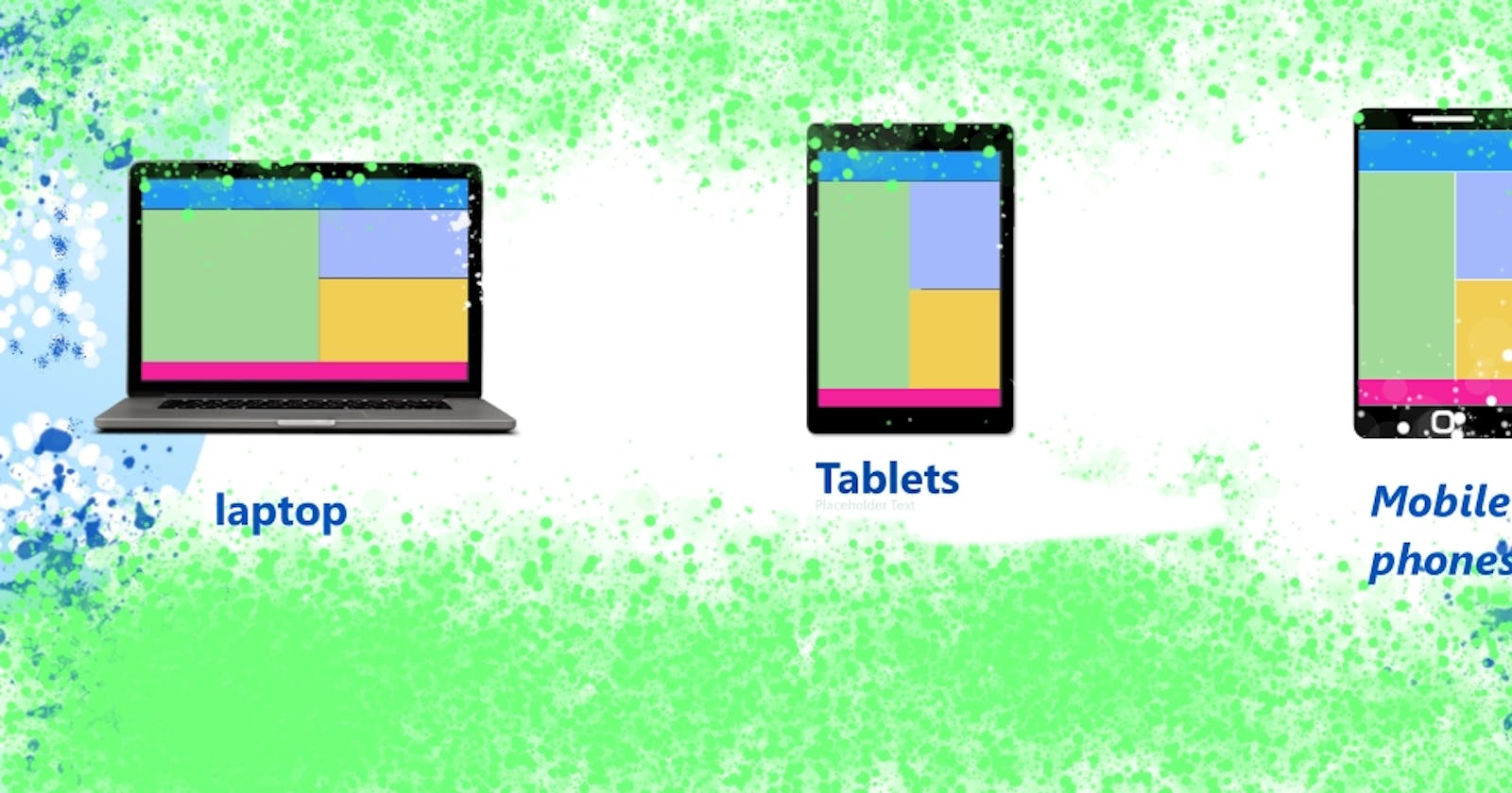
Media query for different devices:
I have demonstrated a code below to show how media query works for different types of screens.
<!DOCTYPE html>
<html lang="en">

<head>
    <meta charset="UTF-8">
    <meta name="viewport" content="width=device-width, initial-scale=1.0">
    <title>Document</title>
    <style>
        div {
            text-align: center;
            font-weight: bold;
            font-size: x-large;
            font-style: oblique;
        }

        @media(max-width:600px) {
            body {
                background-color: aqua;
            }

            div::after {
                font-size: large;
                content: "for mobile phones";
            }
        }

        @media(min-width:600px) {
            body {
                background-color: rgb(253, 247, 90);
            }

            div::after {
                content: "for tablets and phones"
            }
        }

        @media(min-width:768px) {
            body {
                background-color: rgb(72, 255, 0);
            }

            div::after {
                content: "for tablets only";
            }
        }

        @media(min-width:992px) {
            body {
                background-color: rgb(255, 0, 0);
            }

            div::after {
                content: "for laptops";
            }
        }

        @media(min-width:1200px) {
            body {
                background-color: rgb(132, 0, 255);
            }

            div::after {
                content: "for dekstops";
            }
        }
    </style>
</head>

<body>
    <div></div>
</body>

</html>