Introduction:
flexbox, also known as the Flexible Box Layout Module, is a powerful way of designing a responsive layout in CSS in a one-dimensional axis.
Benefits of using Flexbox:
Flexibility and responsiveness: Flexbox makes adaptation easy for different screen sizes and devices.
Space controlling: Make the best alignment of elements within the container.
Simplified code: Flexbox code is easy to maintain and read.
Cross-browser compatibility: Easy to render across various web browsers.
Some fundamental terminologies of Flexbox:
Flex Container: The flex container is a parent element that holds the flex item
Flex Items: They are the children of a flex container.
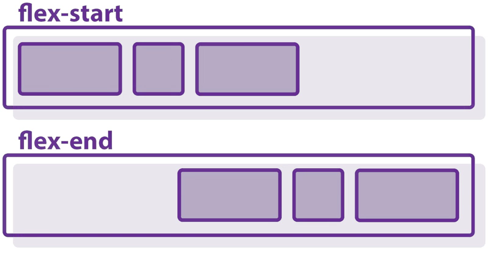
Main Axis: Right to left -left to right or top to bottom - bottom to top.
Cross Axis: The cross axis is perpendicular to the main axis.
Flex Container Property:
The properties of the flexbox applies to the flex items.
Display: The display property sets whether an element is treated as a block or inline box and the layout used for its children.
values: display: flex / inline-flex...
Flex-direction: By default its row, defines the direction in which flex items are to be laid out
values: column, row-reverse...Flex-wrap: Sets whether flex items are forced onto one line or can wrap onto multiple lines.
values: nowrap(default) , wrap...Flex-flow: We can set both flex-direction and flex-wrap.
values: column-reverse, row....Justify-content: Controls the horizontal alignment of flex items within the container.
values: center, space-between...Align-items: Controls the vertical alignment of flex items within the container.
values: center, flex-end....Align-content: It works only when there will be more than one row or column to work width for a single row it acts like align-items.
Gap: Creates space between row and column.
i. row-gap: if we only want a gap in a row.
ii. column-gap: if we only want a gap in the column.
If we have given height and width then the stretch property will not work as they will overwrite it.
Flex items property:
1. Order: By default, it is 0 for all used to give sequence to flex items. Values: Integers, items with lower values are displayed earlier.
2. Flex-grow: The property specifies how much the item will grow relative to the rest of the flexible items inside the same container.
3. Flex-shrink: Controls how much an item shrinks when space is limited. The higher the value the greater the shrinkness.
4. Flex-basis: This property specifies the initial length of a flexible item.If the element is not a flexible item, the flex-basis property has no effect.
5. Align-self: Overrides the container's align-items property for the specific item. In Flexbox, it aligns the item on the cross-axis.
6.Align: It has 3 properties in it: grow shrink basis is respective order
Coding demonstration of it:
<!DOCTYPE html>
<html lang="en">
  <head>
    <meta charset="UTF-8" />
    <meta name="viewport" content="width=device-width, initial-scale=1.0" />
    <title>Document</title>
    <style>
      .main {
        display: flex;
        height: 400px;
        border: 2px solid black;
        /* flex-direction: row-reverse; */
        flex-wrap: wrap;
        /* flex-flow: column-reverse; */
        /* align-items:center; */
        /* align-content:flex-end; */
         /* justify-content: center; */

      }
      .box {
        height: 100px;
        width: 100px;
      }
      .box1 {
        background-color: red;
        align-self:center;
        order: 5;
       flex-shrink: 0;

      }
      .box2 {
        background-color: rgb(4, 255, 0);
        order: -1;
        flex-basis: 200px;
        flex-shrink: 1;
      }
      .box3 {
        background-color: rgb(0, 255, 255);
        flex-grow: 2;
        flex-shrink: 0;

      }
    </style>
  </head>
  <body>
    <dir class="main">
      <dir class="box box1">1</dir>
      <dir class="box box2">2</dir>
      <dir class="box box3">3</dir>
    </dir>
  </body>
</html>
for more refrence you can visit to: https://developer.mozilla.org/en-US/docs/Web/CSS/CSS_flexible_box_layout/Basic_concepts_of_flexbox
